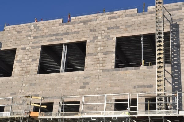
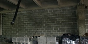
 Look closely at these two pictures. One photo appears to show a very smooth and well-built wall. The other photo shows a wall with a lot of unsightly imperfections. But the truth is that the photos are of the exact same wall. The difference in the two photos is merely lighting.
What’s Behind the Illusion?
The simple explanation: wall grazing or down lighting exaggerates any variance in unit masonry. That is simply the nature of the material. Think about it, there are material tolerances and workmanship tolerances long established by code and standard. All construction materials have these, and masonry is no different.
Material Variances
According to ASTM C90, Standard Specification for Loadbearing Concrete Masonry Units, any individual concrete masonry unit can vary + / - 1/8” in any dimension. And ASTM C216, Standard Specification for Facing Brick allows + / - ¼” tolerance for an FBS brick. These material tolerances are due to the nature of material manufacture and are the outer limits of expectations.
Installation Tolerances
Additionally there are installation tolerances of +/- ¼” over 10’ and slightly more for a 20’ length of the wall. Installation tolerances are often a result of other construction materials installed out of plane or plumb, and the masonry gets installed later.
Why Lighting Matters
For example, a concrete masonry partition may have only one side exposed to view. Think of stairwells or shaft walls where the back side of a wall is not in a public area. In this case, it is simpler to keep the exposed face plumb, taking all the variance on the back, or unexposed side.
In some cases, both sides of a wall are exposed, like a partition wall. With these situations, the mason takes great care in workmanship to make the wall as presentable as possible. Most of the time the finished wall looks great, and the lighting doesn’t highlight slight imperfections.
But when you add down lighting or wall grazing light those minor variances and tolerances are highlighted. Every bit of lippage is exaggerated by shadow when the angle of the light source is close to the wall. The closer the light source, the worse the shadow.
The Bottom Line
With an informed understanding of this effect, all the members of a project team will have similar expectations of a wall’s appearance and can work together to resolve lighting challenges.


